Comprehensive CSS Guide

Everything you need to know about CSS from basics to advanced concepts

CSS Basics

What is CSS?

CSS (Cascading Style Sheets) is a stylesheet language used to describe the presentation of a document written in HTML or XML. CSS describes how elements should be rendered on screen, on paper, in speech, or on other media.

Note: CSS is not a programming language; it's a style sheet language that defines how HTML elements are displayed.
CSS Syntax

CSS consists of style rules that are interpreted by the browser and then applied to the corresponding elements in your document.

selector {
    property: value;
    /* This is a CSS comment */
}
  • Selector - Points to the HTML element you want to style
  • Property - The style attribute you want to change
  • Value - The value you want to assign to the property
  • Declaration - Each property/value pair is a declaration
  • Declaration block - Contains one or more declarations

Ways to Include CSS

1. Inline Styles

<p style="color: blue; font-size: 16px;">This is a paragraph.</p>

2. Internal Stylesheet

<head>
    <style>
        p {
            color: blue;
            font-size: 16px;
        }
    </style>
</head>

3. External Stylesheet (Recommended)

<head>
    <link rel="stylesheet" href="styles.css">
</head>

Best Practice: External stylesheets are preferred as they separate content from presentation and can be cached by browsers.

CSS Comments

Comments are used to explain your code and are ignored by browsers.

/* This is a single-line comment */

/*
This is a
multi-line
comment
*/

Selectors and Specificity

Basic Selectors

Selector Example Description
Element p Selects all <p> elements
Class .intro Selects all elements with class="intro"
ID #header Selects the element with id="header"
Universal * Selects all elements
Grouping h1, h2, h3 Selects all <h1>, <h2>, and <h3> elements

Combinators

Selector Example Description
Descendant div p Selects all <p> elements inside <div> elements
Child div > p Selects all <p> elements where the parent is a <div> element
Adjacent Sibling div + p Selects the first <p> element that is placed immediately after <div> elements
General Sibling div ~ p Selects all <p> elements that are siblings of <div> elements

Attribute Selectors

Selector Example Description
[attribute] [target] Selects all elements with a target attribute
[attribute=value] [target="_blank"] Selects all elements with target="_blank"
[attribute~=value] [title~="flower"] Selects all elements with a title attribute containing "flower"
[attribute|=value] [lang|="en"] Selects all elements with a lang attribute value starting with "en"
[attribute^=value] a[href^="https"] Selects every <a> element whose href attribute value begins with "https"
[attribute$=value] a[href$=".pdf"] Selects every <a> element whose href attribute value ends with ".pdf"
[attribute*=value] a[href*="example"] Selects every <a> element whose href attribute value contains "example"

Pseudo-classes and Pseudo-elements

Common Pseudo-classes

Selector Example Description
:hover a:hover Selects links on mouse hover
:active a:active Selects the active link
:visited a:visited Selects visited links
:focus input:focus Selects input element with focus
:first-child p:first-child Selects first child <p> element
:nth-child() li:nth-child(odd) Selects every odd <li> element
:not() :not(p) Selects every element that is not a <p>

Common Pseudo-elements

Selector Example Description
::before p::before Inserts content before <p> elements
::after p::after Inserts content after <p> elements
::first-letter p::first-letter Selects first letter of <p> elements
::first-line p::first-line Selects first line of <p> elements
::selection ::selection Selects portion of element selected by user

Specificity and Cascade

Specificity determines which CSS rule is applied by browsers when multiple rules could apply to the same element.

Specificity Hierarchy

  1. Inline styles - Highest specificity (1,0,0,0)
  2. IDs - (0,1,0,0)
  3. Classes, attributes and pseudo-classes - (0,0,1,0)
  4. Elements and pseudo-elements - (0,0,0,1)

Calculating Specificity

Count the number of each selector type in a given selector, then concatenate these numbers to get the specificity value.

#nav .list li a:hover  /* 0,1,2,2 */
/* 0 IDs, 1 class, 2 elements, 1 pseudo-class */

Important Rules:
1. !important overrides all other declarations
2. Inline styles override external stylesheets
3. More specific selectors override less specific ones
4. Last rule wins if specificity is equal

Box Model

Understanding the Box Model

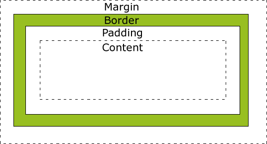
Every element in CSS is represented as a rectangular box with the following properties:

  • Content - The actual content of the box (text, image, etc.)
  • Padding - Clears an area around the content (transparent)
  • Border - A border that goes around the padding and content
  • Margin - Clears an area outside the border (transparent)
CSS Box Model Diagram
div {
    width: 300px;
    padding: 20px;
    border: 5px solid gray;
    margin: 10px;
}

Box-Sizing Property

The box-sizing property defines how the width and height of an element are calculated.

content-box (default)

box-sizing: content-box;
/* Width and height only include content */
/* Total width = width + padding + border */

border-box

box-sizing: border-box;
/* Width and height include content, padding and border */
/* Total width = width (includes padding and border) */

Best Practice: Many developers set box-sizing: border-box on all elements for more intuitive sizing:

* {
    box-sizing: border-box;
}

Margin Collapse

Vertical margins between adjacent elements collapse into a single margin (the largest of the two).

h1 {
    margin-bottom: 20px;
}

p {
    margin-top: 15px;
}
/* Actual margin between h1 and p will be 20px (not 35px) */

Margins collapse in these situations:

  • Adjacent siblings
  • Empty content (no content, padding, or border)
  • Parent and first/last child

Display Property

The display property specifies the display behavior of an element.

Value Description
inline Default for span, a, etc. Width/height ignored
block Default for div, p, etc. Starts on new line
inline-block Like inline but width/height respected
none Element is completely removed
flex Block-level flex container
inline-flex Inline-level flex container
grid Block-level grid container
inline-grid Inline-level grid container
table Behaves like <table>

Visibility Property

The visibility property specifies whether an element is visible or not.

Value Description
visible Default. Element is visible
hidden Element is invisible but still takes up space
collapse For table rows/columns only. Removes space

Note: display: none removes the element from the document flow entirely, while visibility: hidden hides the element but maintains its space.

Typography

Font Properties

Property Description Example
font-family Specifies the font for an element font-family: Arial, sans-serif;
font-size Specifies the size of the font font-size: 16px;
font-weight Specifies the weight of the font font-weight: bold;
font-style Specifies the style of the font font-style: italic;
font-variant Specifies small-caps font font-variant: small-caps;
line-height Specifies the space between lines line-height: 1.5;
font (shorthand) Shorthand for multiple font properties font: italic bold 16px/1.5 Arial;

Text Properties

Property Description Example
color Sets the color of text color: #333;
text-align Aligns text horizontally text-align: center;
text-decoration Adds decoration to text text-decoration: underline;
text-transform Controls text capitalization text-transform: uppercase;
text-indent Indents first line of text text-indent: 20px;
letter-spacing Space between characters letter-spacing: 2px;
word-spacing Space between words word-spacing: 5px;
white-space Controls text wrapping white-space: nowrap;
text-shadow Adds shadow to text text-shadow: 2px 2px 4px #000;

Web Fonts

CSS allows you to use fonts that are not installed on the user's computer.

Using Google Fonts

<!-- In HTML head -->
<link href="https://fonts.googleapis.com/css2?family=Roboto:wght@400;700&display=swap" rel="stylesheet">

/* In CSS */
body {
    font-family: 'Roboto', sans-serif;
}

Using @font-face

@font-face {
    font-family: 'MyFont';
    src: url('myfont.woff2') format('woff2'),
         url('myfont.woff') format('woff');
    font-weight: normal;
    font-style: normal;
}

body {
    font-family: 'MyFont', sans-serif;
}

Vertical Rhythm

Vertical rhythm is a concept that helps maintain consistent spacing between elements.

/* Base font size and line height */
html {
    font-size: 16px;
    line-height: 1.5;
}

/* Margin bottom equals line height */
h1, h2, h3, p, ul, ol {
    margin-bottom: 1.5rem;
}

/* Headings with multiples of line height */
h1 { font-size: 2rem; line-height: 1.5; margin-bottom: 1.5rem; }
h2 { font-size: 1.5rem; line-height: 2; margin-bottom: 1.5rem; }

Colors and Backgrounds

Color Values

CSS supports several ways to specify colors:

Type Example Description
Named colors red Predefined color names
HEX #ff0000 or #f00 Hexadecimal notation
RGB rgb(255, 0, 0) Red, Green, Blue values (0-255)
RGBA rgba(255, 0, 0, 0.5) RGB with alpha transparency (0-1)
HSL hsl(0, 100%, 50%) Hue, Saturation, Lightness
HSLA hsla(0, 100%, 50%, 0.5) HSL with alpha transparency (0-1)

Background Properties

Property Description Example
background-color Sets the background color background-color: #fff;
background-image Sets one or more background images background-image: url("image.jpg");
background-repeat Sets if/how background repeats background-repeat: no-repeat;
background-position Sets starting position of image background-position: center top;
background-size Specifies size of background image background-size: cover;
background-attachment Sets if image scrolls with page background-attachment: fixed;
background (shorthand) Shorthand for multiple properties background: #fff url("image.jpg") no-repeat center;

Gradients

CSS gradients let you display smooth transitions between two or more colors.

Linear Gradient

background: linear-gradient(to right, red, yellow);

Radial Gradient

background: radial-gradient(circle, red, yellow, green);

Conic Gradient

background: conic-gradient(red, yellow, green);

Repeating Gradients

background: repeating-linear-gradient(45deg, red, red 10px, blue 10px, blue 20px);

Opacity

The opacity property sets the opacity level for an element (0.0 - 1.0).

div {
    opacity: 0.5; /* Semi-transparent */
}

Note: opacity affects the entire element and its contents, while rgba() or hsla() only affect the background color.

Layout

Positioning

The position property specifies the type of positioning method used for an element.

Value Description
static Default. Elements render in order of document flow
relative Positioned relative to its normal position
absolute Positioned relative to nearest positioned ancestor
fixed Positioned relative to viewport (stays on screen)
sticky Switches between relative and fixed based on scroll

Positioning Properties

div {
    position: relative;
    top: 20px;
    left: 30px;
}

Properties: top, right, bottom, left, z-index

Floats

The float property specifies how an element should float.

img {
    float: left;
    margin-right: 20px;
}

Clearing Floats

.clearfix::after {
    content: "";
    display: table;
    clear: both;
}

Note: While floats were traditionally used for layouts, modern CSS now prefers Flexbox and Grid for layout purposes.

Flexbox

Flexbox is a one-dimensional layout method for laying out items in rows or columns.

Flex Container Properties

.container {
    display: flex;
    flex-direction: row; /* or column */
    flex-wrap: wrap; /* or nowrap */
    justify-content: center; /* main axis alignment */
    align-items: center; /* cross axis alignment */
    align-content: center; /* multi-line alignment */
    gap: 10px; /* space between items */
}

Flex Item Properties

.item {
    order: 1; /* change visual order */
    flex-grow: 1; /* ability to grow */
    flex-shrink: 1; /* ability to shrink */
    flex-basis: 100px; /* default size */
    align-self: center; /* individual alignment */
}

Flex Shorthand

.item {
    flex: 1 1 100px; /* grow shrink basis */
}

CSS Grid

CSS Grid is a two-dimensional layout system for the web.

Grid Container Properties

.container {
    display: grid;
    grid-template-columns: 1fr 1fr 1fr; /* 3 equal columns */
    grid-template-rows: 100px auto; /* 2 rows */
    gap: 20px; /* space between items */
    grid-template-areas:
        "header header header"
        "sidebar main main";
}

Grid Item Properties

.item {
    grid-column: 1 / 3; /* start at line 1, end at line 3 */
    grid-row: 1; /* row 1 */
    grid-area: header; /* named area */
    justify-self: center; /* alignment within cell */
    align-self: center;
}

Grid Functions

repeat(3, 1fr) /* 3 equal columns */
minmax(200px, 1fr) /* flexible with minimum */
fit-content(400px) /* fits content up to max */

Multi-column Layout

CSS multi-column layout allows easy definition of multiple text columns.

.multi-column {
    column-count: 3;
    column-gap: 20px;
    column-rule: 1px solid #ccc;
}

Properties

  • column-count - Number of columns
  • column-width - Ideal column width
  • column-gap - Space between columns
  • column-rule - Rule between columns
  • column-span - Make element span all columns

Responsive Design

Viewport Meta Tag

Essential for responsive design on mobile devices.

<meta name="viewport" content="width=device-width, initial-scale=1.0">

Viewport Properties

  • width=device-width - Sets width to device width
  • initial-scale=1.0 - Sets initial zoom level
  • minimum-scale=1.0 - Minimum zoom level
  • maximum-scale=1.0 - Maximum zoom level
  • user-scalable=no - Prevents zooming (not recommended)

Media Queries

Media queries allow you to apply CSS styles depending on device characteristics.

/* Default styles for mobile */
body {
    font-size: 14px;
}

/* Tablet styles */
@media (min-width: 768px) {
    body {
        font-size: 16px;
    }
}

/* Desktop styles */
@media (min-width: 1024px) {
    body {
        font-size: 18px;
    }
}

Common Breakpoints

/* Small devices (phones, 576px and up) */
@media (min-width: 576px) { ... }

/* Medium devices (tablets, 768px and up) */
@media (min-width: 768px) { ... }

/* Large devices (desktops, 992px and up) */
@media (min-width: 992px) { ... }

/* Extra large devices (large desktops, 1200px and up) */
@media (min-width: 1200px) { ... }

Responsive Units

CSS offers several units for responsive sizing.

Unit Description
px Pixels (1px = 1/96th of 1in)
% Percentage of parent element
em Relative to font-size of element
rem Relative to font-size of root element
vw 1% of viewport width
vh 1% of viewport height
vmin 1% of viewport's smaller dimension
vmax 1% of viewport's larger dimension

Responsive Images

Techniques for ensuring images work well on all devices.

Basic Responsive Image

img {
    max-width: 100%;
    height: auto;
}

Art Direction with picture element

<picture>
    <source media="(min-width: 800px)" srcset="large.jpg">
    <source media="(min-width: 500px)" srcset="medium.jpg">
    <img src="small.jpg" alt="Description">
</picture>

Resolution Switching with srcset

<img src="small.jpg" 
     srcset="medium.jpg 1000w, large.jpg 2000w" 
     sizes="(max-width: 600px) 100vw, 50vw" 
     alt="Description">

Mobile-First Approach

Designing for mobile first, then enhancing for larger screens.

/* Base styles (mobile) */
.container {
    padding: 10px;
}

/* Medium screens */
@media (min-width: 768px) {
    .container {
        padding: 20px;
    }
}

/* Large screens */
@media (min-width: 1024px) {
    .container {
        padding: 30px;
    }
}

Benefits:
1. Forces focus on core content
2. Results in better performance on mobile
3. Progressive enhancement approach
4. Often simpler to implement

Transforms, Transitions & Animations

Transforms

The transform property applies 2D or 3D transformations to an element.

2D Transforms

transform: translate(50px, 100px); /* Move */
transform: rotate(20deg); /* Rotate */
transform: scale(2, 3); /* Scale */
transform: skew(20deg, 10deg); /* Skew */
transform: matrix(1, -0.3, 0, 1, 0, 0); /* Combine */

3D Transforms

transform: rotateX(180deg);
transform: rotateY(180deg);
transform: rotateZ(90deg);
transform: translate3d(10px, 20px, 30px);
transform: perspective(500px);

Transitions

Transitions allow you to change property values smoothly over a given duration.

div {
    transition: all 0.3s ease;
    /* Shorthand: property duration timing-function delay */
}

div:hover {
    background-color: blue;
}

Transition Properties

  • transition-property - Which properties to transition
  • transition-duration - How long transition takes
  • transition-timing-function - Speed curve
  • transition-delay - When transition starts

Timing Functions

transition-timing-function: ease; /* default */
transition-timing-function: linear;
transition-timing-function: ease-in;
transition-timing-function: ease-out;
transition-timing-function: ease-in-out;
transition-timing-function: cubic-bezier(0.1, 0.7, 1.0, 0.1);

Animations

CSS animations allow animation of most HTML elements without JavaScript.

Keyframes

@keyframes example {
    0%   {background-color: red;}
    50%  {background-color: yellow;}
    100% {background-color: blue;}
}

Animation Properties

div {
    animation-name: example;
    animation-duration: 4s;
    animation-timing-function: ease-in-out;
    animation-delay: 1s;
    animation-iteration-count: 3;
    animation-direction: alternate;
    animation-fill-mode: forwards;
    animation-play-state: running;
    /* Shorthand: name duration timing-function delay iteration-count direction fill-mode */
}

Performance Considerations

Some properties are more performant to animate than others.

Best Properties to Animate

  • transform (translate, scale, rotate)
  • opacity

Avoid Animating

  • width, height
  • margin, padding
  • top, left, right, bottom

Tip: Use will-change to hint to browsers which properties will change for optimization:

div {
    will-change: transform, opacity;
}

Advanced CSS

Variables (Custom Properties)

CSS variables allow you to store values for reuse throughout a document.

:root {
    --primary-color: #3498db;
    --padding: 15px;
}

.element {
    color: var(--primary-color);
    padding: var(--padding);
}

Features

  • Scoped to selector (use :root for global)
  • Can be modified with JavaScript
  • Fallback values: var(--color, blue)
  • Can be used in calc()

Filters

The filter property applies graphical effects like blur or color shift.

img {
    filter: blur(5px);
    filter: brightness(150%);
    filter: contrast(200%);
    filter: grayscale(50%);
    filter: hue-rotate(90deg);
    filter: invert(100%);
    filter: opacity(50%);
    filter: saturate(200%);
    filter: sepia(100%);
    filter: drop-shadow(5px 5px 5px #333);
    /* Multiple filters */
    filter: contrast(175%) brightness(103%);
}

Blend Modes

Blend modes define how elements should blend with the content below them.

Background Blend Modes

div {
    background-image: url('image1.jpg'), url('image2.jpg');
    background-blend-mode: multiply;
}

Mix Blend Modes

div {
    mix-blend-mode: screen;
}

Common Blend Modes

  • normal, multiply, screen
  • overlay, darken, lighten
  • color-dodge, color-burn
  • hard-light, soft-light
  • difference, exclusion
  • hue, saturation, color, luminosity

Clipping and Masking

Clip-path

clip-path: circle(50% at 50% 50%);
clip-path: polygon(50% 0%, 100% 50%, 50% 100%, 0% 50%);
clip-path: url(#myClip); /* SVG clip path */

Mask

mask-image: url('mask.png');
mask-mode: alpha;
mask-position: center;
mask-repeat: no-repeat;
mask-size: cover;

Feature Queries

Feature queries (@supports) test if a browser supports a CSS feature.

@supports (display: grid) {
    /* CSS rules for browsers that support grid */
}

@supports not (display: grid) {
    /* Fallback for browsers that don't support grid */
}

@supports (display: grid) and (shape-outside: circle()) {
    /* Multiple feature test */
}

CSS Methodologies

BEM (Block, Element, Modifier)

A naming convention that makes CSS more maintainable.

Naming Convention

.block {} /* Standalone component */
.block__element {} /* Part of block */
.block--modifier {} /* Different state of block */

Example

<div class="card card--featured">
    <img class="card__image" src="...">
    <h3 class="card__title">Title</h3>
    <p class="card__text">...</p>
</div>

OOCSS (Object-Oriented CSS)

Separates structure from skin and container from content.

Principles

  1. Separate structure from skin - Keep layout and design separate
  2. Separate container from content - Make elements reusable

Example

<div class="media">
    <img class="media__image" src="...">
    <div class="media__body">...</div>
</div>

SMACSS (Scalable and Modular Architecture)

Categorizes CSS rules to make them more modular.

Categories

  • Base - Default styles (html, body, a, etc.)
  • Layout - Major layout components
  • Module - Reusable components
  • State - How modules look in different states
  • Theme - Look-and-feel (optional)

ITCSS (Inverted Triangle CSS)

Organizes CSS from generic to explicit, low to high specificity.

Layers

  1. Settings - Variables, config
  2. Tools - Mixins, functions
  3. Generic - Reset, normalize
  4. Elements - Unclassed HTML elements
  5. Objects - Design patterns (OOCSS)
  6. Components - UI components
  7. Utilities - Helper classes

CSS Preprocessors

SASS/SCSS

Syntactically Awesome Style Sheets (SASS) is a CSS preprocessor with two syntaxes:

SCSS (Sassy CSS)

$primary-color: #333;

body {
    color: $primary-color;

    .container {
        width: 100%;
    }
}

SASS (Indented Syntax)

$primary-color: #333

body
    color: $primary-color
    
    .container
        width: 100%

Features

  • Variables
  • Nesting
  • Mixins
  • Inheritance
  • Operators
  • Functions
  • Control directives
  • Modules

LESS

Leaner Style Sheets (LESS) is another popular CSS preprocessor.

@primary-color: #333;

body {
    color: @primary-color;
    
    .container {
        width: 100%;
    }
}

Features

  • Variables
  • Mixins
  • Nested rules
  • Operations
  • Functions
  • Namespaces
  • Scope

PostCSS

A tool for transforming CSS with JavaScript plugins.

Common Plugins

  • Autoprefixer - Adds vendor prefixes
  • CSSnano - Minifies CSS
  • PostCSS Preset Env - Future CSS syntax
  • Stylelint - Lints CSS

Example

/* Input */
:root {
    --mainColor: #123456;
}

body {
    color: var(--mainColor);
    display: flex;
}

/* Output (with Autoprefixer) */
body {
    color: #123456;
    display: -webkit-box;
    display: -ms-flexbox;
    display: flex;
}

CSS Frameworks

Bootstrap

The most popular CSS framework for responsive, mobile-first projects.

Features

  • Responsive grid system
  • Extensive component library
  • Customizable with SASS
  • JavaScript plugins

Example

<div class="container">
    <div class="row">
        <div class="col-md-6">Column 1</div>
        <div class="col-md-6">Column 2</div>
    </div>
</div>

Tailwind CSS

A utility-first CSS framework for rapidly building custom designs.

Features

  • Utility classes for everything
  • No opinion about design
  • PurgeCSS built-in
  • Highly customizable

Example

<div class="max-w-md mx-auto bg-white rounded-xl shadow-md overflow-hidden md:max-w-2xl">
    <div class="md:flex">
        <div class="p-8">
            <div class="uppercase tracking-wide text-sm text-indigo-500 font-semibold">Case study</div>
            <a href="#" class="block mt-1 text-lg leading-tight font-medium text-black hover:underline">Finding customers for your new business</a>
        </div>
    </div>
</div>

Foundation

A responsive front-end framework with advanced features.

Features

  • Flexbox-based grid
  • Accessible components
  • Motion UI for animations
  • Email framework

Bulma

A modern CSS framework based on Flexbox.

Features

  • Pure CSS (no JavaScript)
  • Simple syntax
  • Modular (import only what you need)
  • Responsive design

CSS Best Practices

Organization and Structure

  • Follow a consistent naming convention (BEM, SMACSS, etc.)
  • Organize CSS in logical sections (reset, typography, components, etc.)
  • Use comments to separate sections
  • Keep selectors short and specific
  • Avoid overly specific selectors (don't nest too deep)
  • Group related properties together (positioning, box model, typography, etc.)

Performance

  • Minify CSS for production
  • Use efficient selectors (avoid universal selectors)
  • Reduce redundancy with inheritance and utility classes
  • Use CSS sprites for multiple small images
  • Consider critical CSS for above-the-fold content
  • Use will-change for elements you plan to animate
  • Limit use of expensive properties like box-shadow and border-radius

Maintainability

  • Use CSS variables for theming and consistency
  • Keep styles modular and component-based
  • Avoid !important (use specificity instead)
  • Document complex CSS with comments
  • Use a preprocessor for large projects
  • Implement a style guide or design system
  • Use linting tools to enforce consistency

Accessibility

  • Ensure sufficient color contrast
  • Don't rely solely on color to convey information
  • Use relative units (em, rem) for font sizes
  • Style focus states for keyboard navigation
  • Test with screen readers and keyboard-only navigation
  • Consider prefers-reduced-motion for animations
  • Use semantic HTML as a base for styling

CSS Resources

Backgrounds and Borders

Background Properties

  • background-size Property: This property is used to set the background size for an element. Some common values include cover for the background image to cover the entire element and contain for the background image to fit within the element.
  • background-repeat Property: This property is used to determine how background images should be repeated along the horizontal and vertical axes. The default value for background-repeat is repeat meaning the image will repeat both horizontally and vertically. You can also specify that there should be no repeat by using the no-repeat property.
  • background-position Property: This property is used to specify the position of the background image. It can be set to a specific length, percentage, or keyword values like top, bottom, left, right, and center.
  • background-attachment Property: This property is used to specify whether the background image should scroll with the content or remain fixed in place. The main values are scroll (default), where the background image scrolls with the content, and fixed, where the background image stays in the same position on the screen.
  • background-image Property: This property is used to set the background image of an element. You can set multiple background images at the same time and use either the url, radial-gradient or linear-gradient functions as values.
  • background Property: This is the shorthand property for setting all background properties in one declaration. Here is an example of setting the background image and setting it to not repeat: background: no-repeat url("example-url-goes-here");
  • Good Contrast for Background and Foreground Colors: It is important to ensure that the background and foreground colors have good contrast to make the text readable. The Web Content Accessibility Guidelines (WCAG) recommend a minimum contrast ratio of 4.5:1 for normal text and 3:1 for large text.

Borders

  • border-top Property: This property is used to set the styles for the top border of an element. border-top: 3px solid blue; sets a 3-pixel-wide solid blue border on the top side of the element.
  • border-right Property: This property is used to set the styles for the right border of an element. border-right: 2px solid red; sets a 2-pixel-wide solid red border on the right side of the element.
  • border-bottom Property: This property is used to set the styles for the bottom border of an element. border-bottom: 1px dashed green; sets a 1-pixel-wide dashed green border on the bottom side of the element.
  • border-left Property: This property is used to set the styles for the left border of an element. border-left: 4px dotted orange; sets a 4-pixel-wide dotted orange border on the left side of the element.
  • border Property: This is the shorthand property for setting the width, style, and color of an element's border. border: 1px solid black; sets a 1-pixel-wide solid black border.
  • border-radius Property: This property is used to create rounded corners for an element's border.
  • border-style Property: This property is used to set the style of an element's border. Some accepted values include solid, dashed, dotted, and double.

Gradients

  • linear-gradient() Function: This CSS function is used to create a transition between multiple colors along a straight line.
  • radial-gradient() Function: This CSS function creates an image that radiates from a particular point, like a circle or an ellipse, and gradually transitions between multiple colors.

Design Fundamentals

Design Terminology

  • Layout: This is how visual elements are arranged on a page or screen to communicate a message. These elements may include text, images, and white space.
  • Alignment: This is how the elements are placed in relation to one another. Using alignment correctly is helpful for making the design look clean and organized.
  • Composition: This is the act of arranging elements to create a harmonious design. It determines how elements like images, text, and shapes relate to each other and contribute to the design in an artistic way.
  • Balance: This is how visual weight is distributed within a composition. Designers aim to create an equilibrium through symmetrical or asymmetrical arrangements.
  • Scale: This refers to comparing the dimensions or size of one element to that of another.
  • Hierarchy: This establishes the order of importance of the elements in a design. It's about making sure that the most important information is noticed first.
  • Contrast: This is the process of creating clear distinctions between the elements. You can do this through variations in color, size, shape, texture, or any other visual characteristic. Strong contrast is also helpful for improving readability.
  • White Space(negative space): This is the empty space in a design. It's the area surrounding the elements.
  • UI(User Interface): UI includes the visual and interactive elements that users can see on their screens, like icons, images, text, menus, links, and buttons.
  • UX(User Experience): UX is about how users feel when using a product or service. An application with a well-design user experience is intuitive, easy to use, efficient, accessible, and enjoyable.
  • Design Brief: This is a document that outlines the objectives, goals, and requirements of a project. It is a roadmap that guides the design process and ensures that the final product meets the needs of the client.
  • Vector Based Design: This involves creating digital art using mathematical formulas to define lines, shapes, and colors.
  • Prototyping: This refers to the process of creating an interactive model of a product or user interface.

UI Design Fundamentals

  • Good Contrast for Background and Foreground Colors: It is important to ensure that the background and foreground colors have good contrast to make the text readable. The Web Content Accessibility Guidelines (WCAG) recommend a minimum contrast ratio of 4.5:1 for normal text and 3:1 for large text.
  • Good Visual Hierarchy in Design: A strong visual hierarchy can provide a clear path for the eye to follow, ensuring that the information you convey is consumed in the order that you intend.
  • Responsive Images: Responsive images are images that scale to fit the size of the screen they are being viewed on. This is important because it ensures that your images look good on all devices, from desktops to mobile phones.
  • Progressive Enhancement: This is a design approach that ensures all users, regardless of browser or device, can access the essential content and functionality of an application.
  • User-centered Design: This is an approach that prioritizes the end user, from their needs to their preferences and limitations. The goal of user-centered design is to craft a web page that is intuitive, efficient to use, and pleasing for your users to interact with.
  • User Research: This is the systematic study of the people who use your product. The goal is to measure user needs, behaviors, and pain points.
  • Exit Interviews: This is a survey you can give to users when they cancel their accounts. It can help you understand why users are leaving and what you can do to reduce churn.
  • User Testing: This refers to the practice of capturing data from users as they interface with your application.
  • A/B Testing: This is the process of shipping a new feature to a randomly selected subset of your user base. You can then leverage analytics data to determine if the feature is beneficial.
  • User Requirements: This refers to the stories or rubric that your application needs to follow. User requirements might be defined by user research or industry standards. They can even be defined by stakeholder input.
  • Progressive Disclosure: This is a design pattern used to only show users relevant content based on their current activity and hide the rest. This is done to reduce cognitive load and make the user experience more intuitive.
  • Deferred/Lazy Registration: This is a UI design pattern that allows users to browse and interact with your application without having to register.

Design Best Practices

  • Dark Mode: This is a special feature on web applications where you can change the default light color scheme to a dark color scheme. You should use desaturated colors in dark mode. Desaturated colors are colors that are less intense and have a lower saturation level.
  • Breadcrumbs: This is a navigation aid that shows the user where they are in the site's hierarchy. It is best to place breadcrumbs at the top of the page so users can easily find it. Also, you want to make sure the breadcrumbs are large enough to be easily read, but not so large that they take up too much space on the page.
  • Card Component: Your card component should be simple in design, not visually cluttered or display too much information. For media, make sure to choose high-quality images and videos to enhance the user experience.
  • Infinite Scroll: This is a design pattern that loads more content as the user scrolls down the page. You should consider using a load more button because it gives a user control over when they want to see more content. You can also add a back button so users have the ability to go back to the previous page without having to scroll all the way back up.
  • Modal Dialog: This is a type of pop-up that will display on top of existing page content. Usually the background content will have a dim color overlay in order to help the user better focus on the modal content. Also, it is always a good idea to allow the user to click outside of the modal to close it. When you use the HTML dialog element, you will get a lot of the functionality and accessibility benefits built in.
  • Progress Indication for Form Registration: This is a way to show users how far they are in a process. It can be used in forms, registration, and setup processes. Your design should be simple, easy to find, and make it possible to go back to previous steps.
  • Shopping Cart: Carts are a place for user to see what item they have already selected on an e-commerce platform. Your carts should always be visible to the user, use a common icon like a cart, bag or basket, and have a clear call-to-action button for users to proceed to checkout.

Common Design Tools

  • Figma: This cloud-based tool specializes in User Interface and User Experience (UI / UX) design. It enables design and development teams to collaborate from anywhere, offering built-in features including Vector-based design, automatic layout, a commenting and feedback system and more.
  • Sketch: This is a popular design tool used for its intuitive interface and simplicity, making it ideal for developers who want to quickly create prototypes. It's also widely used by designers for tasks like creating UIs, icons, and web layouts.
  • Adobe XD: This is a vector-based design and prototyping tool for UI/UX design, known for its seamless integration with other Adobe apps like Photoshop, Illustrator, and After Effects.
  • Canva: This tool allows you to create a wide range of visual content, including posters, cover photos, presentations, short videos, and more. Its user-friendly and simple design makes it ideal for beginners.